Color season · Spring family
Bright (Clear) Spring Color Palette
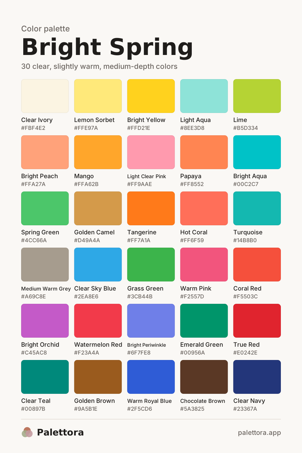
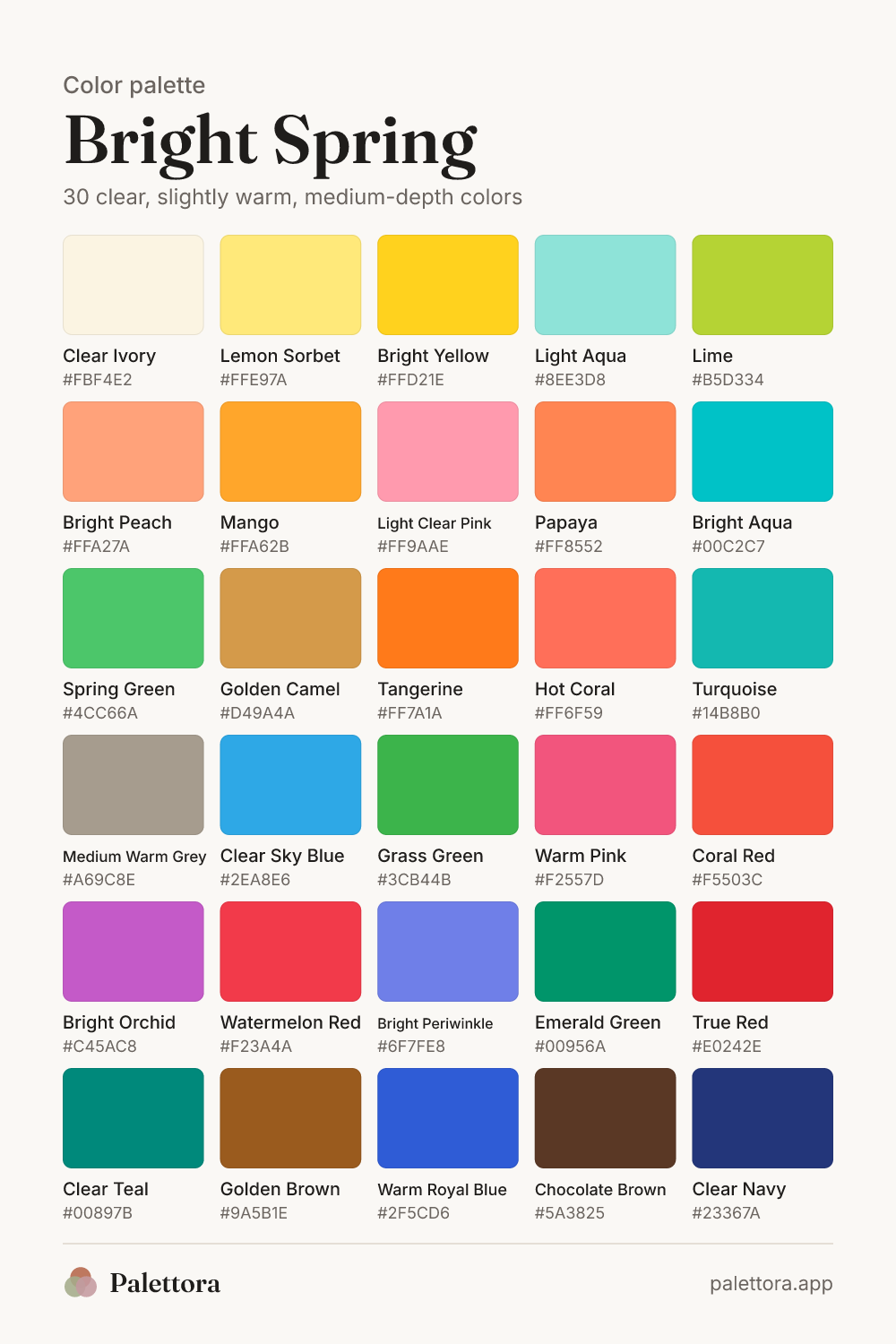
Bright Spring is a clear, high-contrast color season with a slight warm lean. Its colors are saturated and vivid: coral red, turquoise, bright yellow, warm pink, grass green and clear navy. Also called Clear Spring, it sits where spring meets winter, so clarity matters more than warmth.
You may be a Bright Spring if your eyes are vivid and sparkling, your hair is noticeably darker or lighter than your skin, and muted colors make you look washed out. The bright spring color palette below has 30 hex codes, plus neutrals, makeup, hair, outfits, and the tests that separate you from Bright Winter and Warm Spring.
- Undertone
- Neutral-warm
- Depth
- Medium
- Chroma
- Bright (clear)
- Contrast
- High
The Bright Spring color palette, color by color
Tap any swatch to copy its hex code, or download the full palette as an image for your phone.
How to read this palette
Start with chroma, since it is the trait that defines you. Every color here is clean and saturated, with no grey mixed in. Coral red, mango, spring green and bright aqua look like they were just painted.
Hue comes second. The palette leans warm, but only a little, so it holds yellow-based colors like tangerine and lime alongside cooler-looking ones like clear sky blue, bright periwinkle and warm royal blue. What links them is purity, not temperature.
Value spans the widest range of any spring. Clear ivory and lemon sorbet sit at the light end, clear navy and chocolate brown at the dark end. That range lets you wear real contrast, such as navy with ivory or turquoise with chocolate, which other springs cannot carry.
What is Bright Spring?
Bright Spring is the clearest, most saturated spring season, with a warm lean and high contrast. Coral red, turquoise, bright yellow and grass green make you look awake. Dusty, greyed or heavy colors swallow your features.
- Skin: ivory, light peach, warm beige, golden olive, bronze or deep golden brown, often with a clear, almost translucent look.
- Hair: medium to dark golden brown, chestnut, dark auburn or bright golden blonde. Hair is often noticeably darker than the skin.
- Eyes: the giveaway. Bright turquoise, clear green, topaz, or warm brown with a vivid ring and strong whites.
- Contrast: medium-high to high. Your hair, skin and eyes are clearly separate, and your face can hold strong color.
- Pastels and dusty shades make you look faded, while saturated colors make your eyes look brighter.
A quick self-test
Use two scarves of the same hue. In daylight, without makeup, hold a clear turquoise scarf under your chin, then a greyed, dusty teal one. If the clear version makes your eyes sparkle and the dusty one makes your face look tired, you are a bright season. If warm coral then beats cool fuchsia, Bright Spring fits.
Best Bright Spring neutrals
Clear navy is your strongest neutral. It does almost everything black does, but with the clarity your coloring needs. Clear ivory stands in for white, golden camel and medium warm grey fill the middle, and dark espresso is the nearest you get to black. Pair a dark neutral with a light one to keep your natural contrast.
Colors Bright Spring should avoid
- Dusty Lavender#B8A9C4
- Sage Grey#A3AE97
- Mushroom Taupe#9C8F85
- Oatmeal#E2D3B9
- Khaki Olive#6E6B2F
- Brick Brown#8A4A3A
- Aubergine#4B2A3A
Muted colors are your real enemy. Dusty lavender, sage grey, mushroom taupe and oatmeal have grey or beige mixed in, so next to clear eyes and skin they look like a faded photo. Khaki olive, brick brown and aubergine are dark and dull at the same time, which drags your face down. If you love one, wear it with a bright accent near your face.
Metals and jewelry
- Polished yellow gold
- Bright rose gold
- Polished silver
- White gold
Shine matters more than metal color for you. High-polish yellow gold is easiest, but polished silver and white gold also work because they are clear and reflective. Mixed metals suit your near-neutral undertone. Skip brushed, antique or oxidised finishes; they look dull against your coloring.
Bright Spring makeup
Most Bright Springs need a neutral to slightly warm foundation. Test three shades on your jaw in daylight and pick the one that vanishes. A satin finish keeps your skin's natural clarity better than a heavy matte.
- Coral Red#F5503C
- Clear Watermelon#F0485A
- Warm Pink#F2557D
- Bright Poppy#E8432E
- Clear Peach Pink#F57E7E
- Bright Coral#FF7F6A
- Clear Warm Pink#F7708E
- Bright Peach#FFA27A
- Clear Navy#23367A
- Bright Teal#00897B
- Golden Bronze#A86A26
- Champagne Gold#E5C27A
- Dark Chocolate#4A2E1E
- Emerald#00956A
Bright Spring hair colors
Rich golden brown
Keeps your contrast high while adding warmth. Ask for a glossy finish.
Dark chestnut
A clear red-brown that frames bright eyes without the flatness of black.
Bright golden blonde
Only if your natural color is light. Keep it clean and shiny, never ashy.
Clear auburn
A saturated red-brown that suits green or turquoise eyes. Stop short of burgundy.
Caramel ribbons on dark brown
Defined, bright pieces on a deep base echo your natural contrast.
Hair colors to avoid
- Ashy, mousy or greige shades, which dull your hair and your skin with it.
- Flat matte black with no warmth or shine, which looks heavier than your natural coloring.
- Very soft, blended balayage that lowers your contrast too far.
Nail colors for Bright Spring
High-gloss polish suits you more than matte. True red and coral red are classic choices, and clear navy is a smart office alternative to black. A milky or nude manicure can look washed out, so choose bright peach for your everyday neutral.
Bright Spring clothing and outfit tips
- Keep at least one clear, saturated color near your face. A turquoise top under a navy blazer looks far better on you than a beige one.
- Build outfits with contrast. Navy with ivory, chocolate with turquoise or coral red with clear ivory echo the light and dark in your coloring.
- Pick crisp, smooth fabrics: poplin, silk, satin, gabardine and fine merino. Fuzzy, heathered textures look muddy on you.
- If a muted color has to stay, add a bright accessory. A dusty office uniform improves with a coral red lipstick or turquoise earrings.
- Try color blocking with two brights from the palette, such as warm pink with tangerine or grass green with bright yellow.
- Choose dark indigo or clean white-ivory denim over faded, grey-washed jeans.
Outfit combinations
Navy and coral
Clear NavyCoral RedClear Ivory
A clear navy suit with a coral red top and clear ivory sneakers. Crisp and confident.
Tropical
TurquoiseMangoChocolate Brown
A turquoise dress with a mango bag and chocolate brown sandals.
Lime pop
LimeWarm Royal BlueClear Ivory
Warm royal blue trousers, a clear ivory shirt and a lime cardigan over the shoulders.
Pink and green
Warm PinkGrass GreenGolden Camel
A warm pink blouse, grass green skirt and golden camel heels. Bold but balanced.
Summer whites
Clear IvoryBright AquaBright Yellow
Clear ivory linen with a bright aqua top and a bright yellow straw bag.
Evening red
True RedDark EspressoPale Stone
A true red dress with dark espresso heels and a pale stone wrap.
Weekday grey
Medium Warm GreyClear TealClear Navy
A medium warm grey blazer, clear teal sweater and clear navy jeans.
Build a small capsule wardrobe
- Anchor the wardrobe with clear navy and clear ivory. Together they cover trousers, coats, shirts and knitwear.
- Add golden camel or medium warm grey as a third neutral for coats and blazers.
- Pick three brights that work with navy and ivory, such as coral red, turquoise and grass green, and buy tops and dresses in them.
- Finish with one statement item in an unexpected bright, like a mango bag or warm pink shoes.
Patterns and prints
Bold stripes
Spring Green and Bright Orchid on Clear Ivory
Color block
Medium Warm Grey and Emerald Green on Bright Yellow
Graphic dots
Spring Green and Golden Brown on Lime
Geometric
Medium Warm Grey and Clear Navy on Mango
- Choose high-contrast, crisp prints: navy and ivory stripes, coral on ivory, turquoise on navy.
- Graphic motifs suit you: bold florals, geometric shapes, tropical prints, polka dots and color-blocked panels.
- Medium to large scale works, because your coloring can carry it. Tiny, low-contrast prints read as a blur.
- Avoid watercolour, faded or heathered prints. Edges should be sharp and colors should be clean.
Accessories and natural materials
- Glossy materials: patent leather, lacquer, enamel, polished wood, clear acrylic and colored glass.
- Glasses in clear navy, bright tortoiseshell, red or turquoise acetate. Muted brown or grey frames dull your eyes.
- Clear, faceted stones: turquoise, emerald, peridot, coral, citrine and blue topaz.
- Bags and shoes in a bright color, like coral red or turquoise, turn a neutral outfit into a Bright Spring one.
How to tell Bright Spring from Bright Winter and Warm Spring
Bright Spring vs Bright Winter
- What you share
- Both are bright first, with high contrast, vivid eyes and a liking for saturated color, navy and crisp lines.
- What differs
- Bright Spring leans warm, toward coral, mango, turquoise and golden camel. Bright Winter leans cool, toward fuchsia, cobalt, icy lemon and black. Gold looks easy on you; silver looks easy on them.
- How to tell which you are
- Hold a coral red and a blue-red or hot pink to your face. If coral makes your skin glow, you are Bright Spring. If hot pink looks cleaner and coral turns orange, try Bright Winter.
- Colors to borrow from Bright Winter
- Bright Winter shares your clarity. Warm royal blue, bright orchid and true red are the coolest colors you own and the ones that overlap most with its cobalt, hot pink and red. Leave its icy pastels and pure black alone.
- Warm Royal BlueBright OrchidTrue Red
Bright Spring vs Warm Spring
- What you share
- Both are spring seasons with golden warmth and clear color. Turquoise, coral and grass green suit both.
- What differs
- Warm Spring is more golden and has medium contrast, so it rarely wears navy. Bright Spring is clearer and higher in contrast, so navy, near-black espresso and cooler blues all work.
- How to tell which you are
- Wear clear navy and golden brown in turn. If navy sharpens your face, you are Bright Spring. If navy looks severe and golden brown looks warm and easy, you are probably Warm Spring.
- Colors to borrow from Warm Spring
- Warm Spring is your golden neighbour. Tangerine, golden camel and golden brown take its warmth while staying clear. Its paler peaches and softer camels can look too gentle on you.
- TangerineGolden CamelGolden Brown
Bright Spring questions
Yes. Clear Spring and Bright Spring are two names for one season. Both describe coloring that is clear first and warm second, with vivid eyes and noticeable contrast. You may also see it called a spring-winter mix, because it borrows clarity from winter.
Better than any other spring, but it is still not your best. Black is fine in an outfit with a bright accent, such as a coral red top under a black jacket. Near your face, clear navy or dark espresso usually look clearer and softer at the same time.
Most pastels are too faint for you. The exceptions are clear, slightly saturated light shades like lemon sorbet, light aqua and light clear pink. Wear them with a dark neutral like navy, so the outfit still has the contrast your face needs.
Deep golden or bronze skin with bright eyes can be Bright Spring. Your best shades are often the saturated middle: coral red, turquoise, emerald green, mango and warm royal blue. Clear ivory, your palest shade, may need a bright accessory nearby so it does not look chalky.
Twelve-season systems give each season one main trait, so Bright Spring is simply clear first and warm second. Systems with 16 types often add finer versions, such as a brighter one close to winter and a warmer one close to Warm Spring. Read the description, not just the label.
Not sure you are Bright Spring? The quiz scores warmth, depth and clarity separately and also shows your runner-up season.
Take the color quizRelated seasons
- Bright WinterNeighbour season: Bright Winter is the most vivid season of all: clear, saturated and slightly cool, with strong contrast.
- Warm SpringNeighbour season: Warm Spring is the most golden of the spring seasons, with clear, sunny, medium-light colors.
- Light SpringAlso in the spring family.
- All 12 seasonsCompare every palette side by side.